Designing for Park Ticket Management
In-app Wallet for Universal Studios Japan
Overview
The Universal Studios Japan app allowed guests to view the park map and see attraction wait times but had yet to include the ability to sign in to their Universal account. With the introduction of these basic account features in 2025, the Mobile App team needed to create an app wallet where users could store their tickets for easy access when navigating the park. The app wallet launched in the Universal Studios Japan app in December 2025.
My Role
In my role as the lead UX/UI Designer, I owned the design of the app wallet, created prototypes and wireframes, gained multi-language stakeholder alignment, and prepared comprehensive documentation for handoff. I collaborated closely with product owners, developers, and leadership on the overall UX strategy, as updates to this feature would eventually be implemented in the Universal Studios apps for Orlando and Hollywood.
Contributions
UX/UI Strategy & Design
Product Strategy & Business Objectives
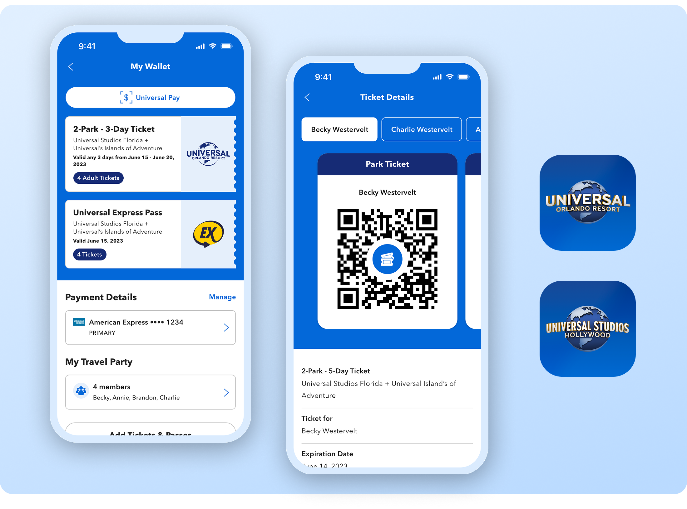
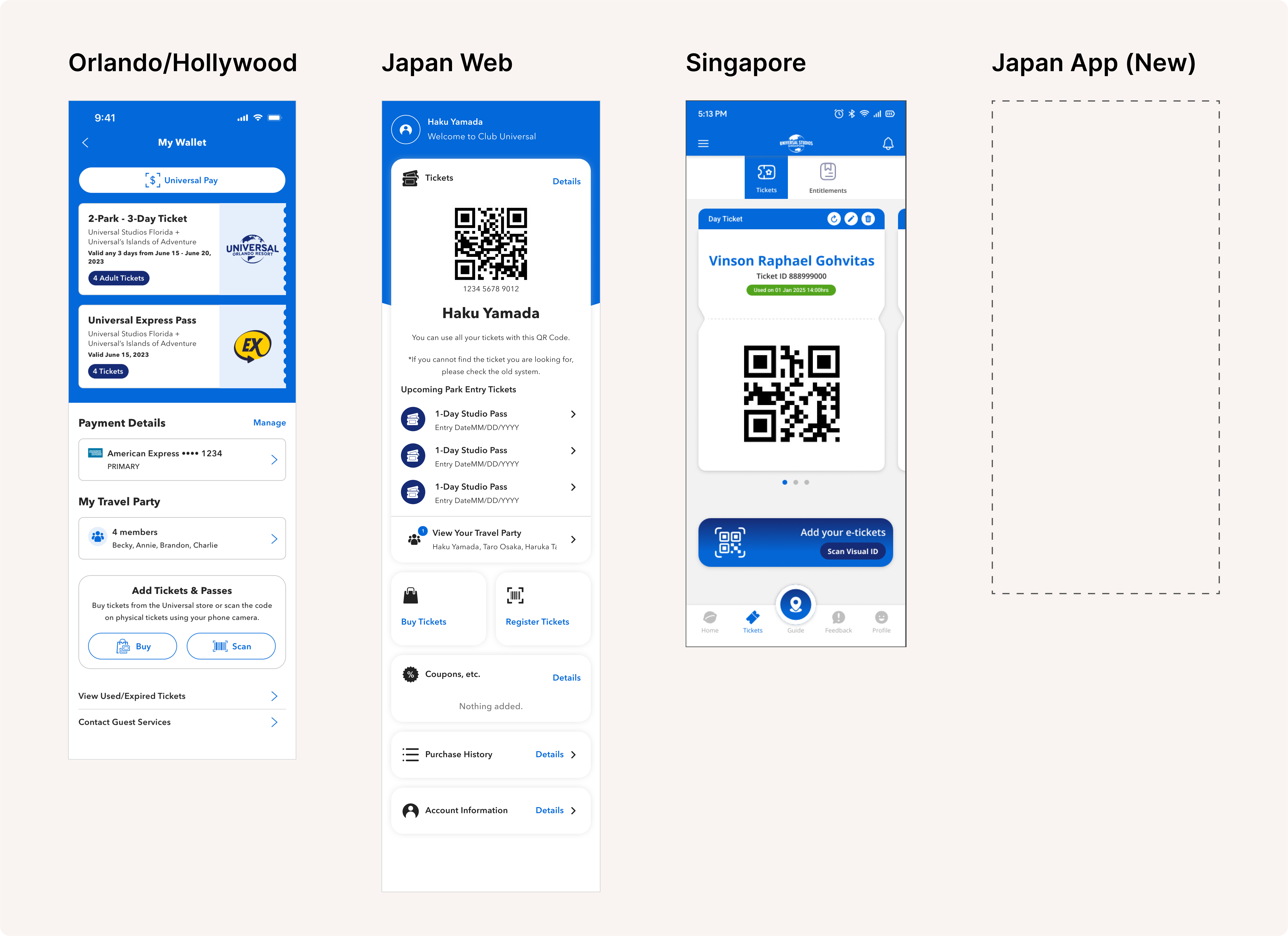
While other Universal products already included a digital Wallet, the park operations and local audience for Universal Studios Japan (USJ) required a unique approach for this feature.
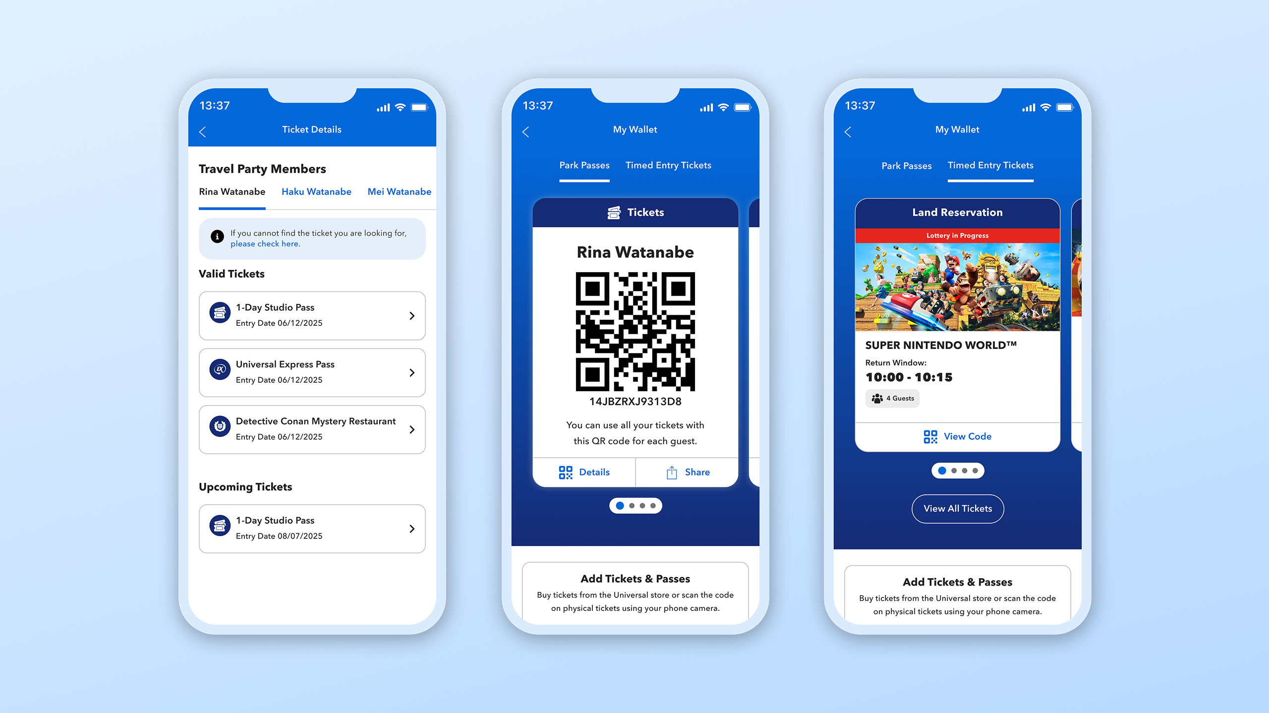
Multiple Ticket Types
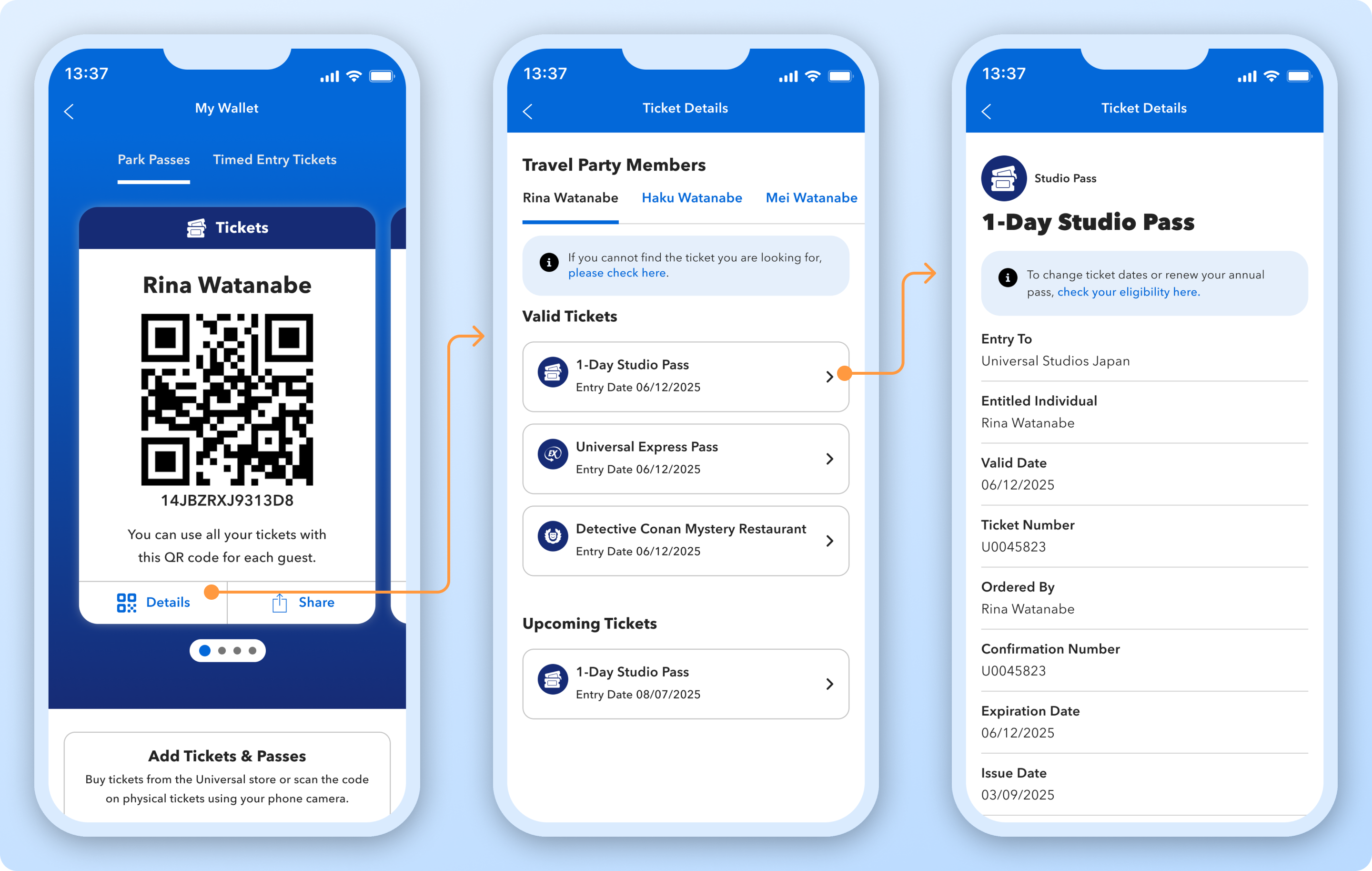
Users needed the ability to store multiple types of tickets for each person and hold all tickets for multiple people in one place.
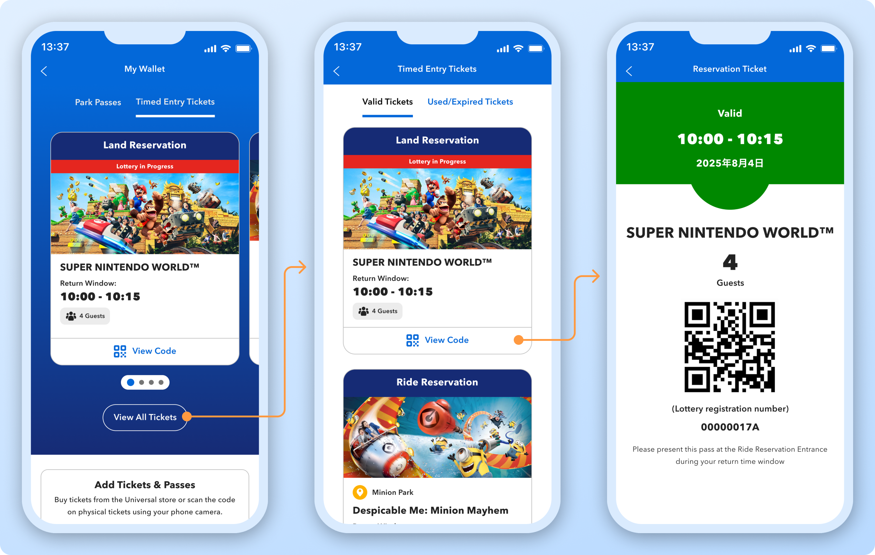
Each person would have a unified QR code (one QR code that holds all their park entry tickets) and the ability to have timed entry tickets for specific attractions for their entire group.
Cohesive Experience
To meet user expectations for functionality, the wallet needed to include existing features from the web experience, such as the ability to view coupons, while incorporating new features, like the ability to acquire a timed entry ticket for an attraction.
Japanese Audience Considerations
While the team creating this feature was based in the U.S., we collaborated closely with Japanese stakeholders to meet both functional and cultural expectations of the audience, as well as ensure all content was translated and localized accurately.
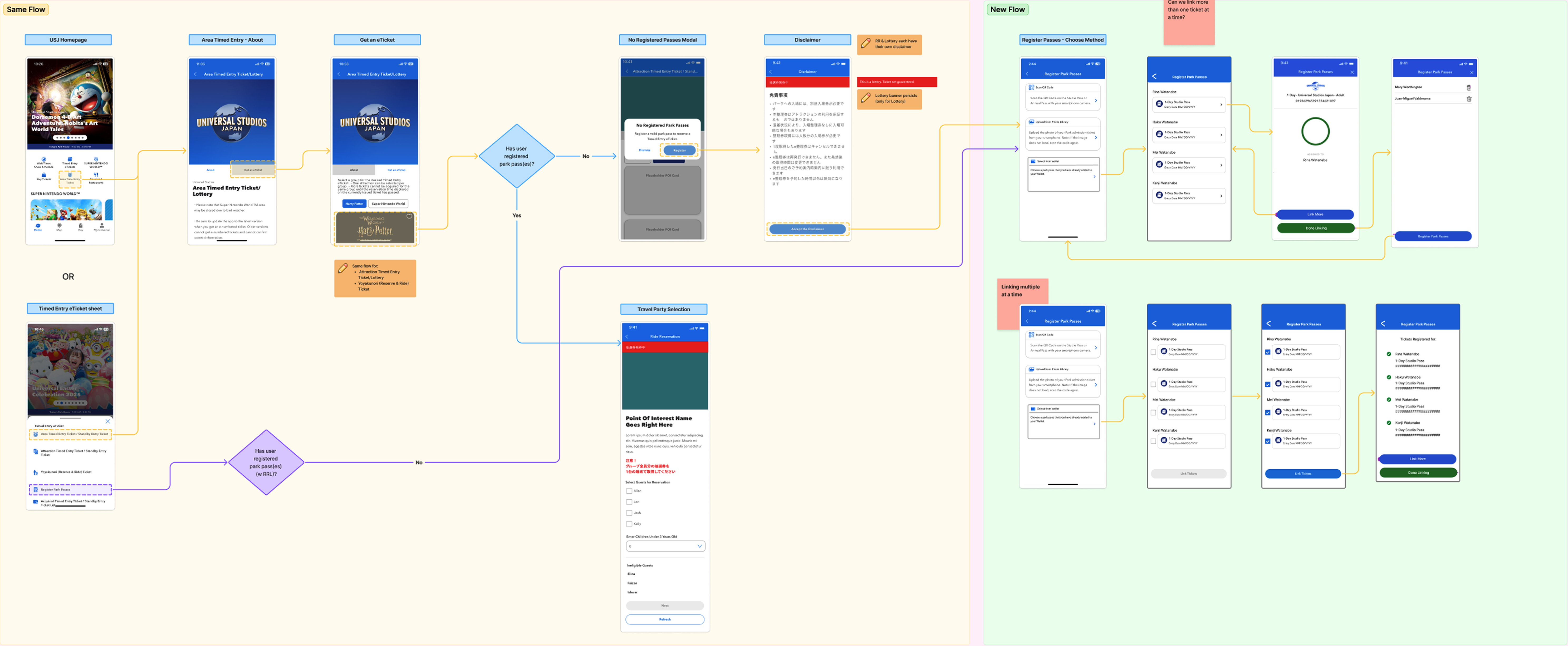
Flow Mapping
Once I understood the product requirements, I created both low-fidelity and mid-fidelity flow maps to better visualize and communicate intentions to stakeholders.
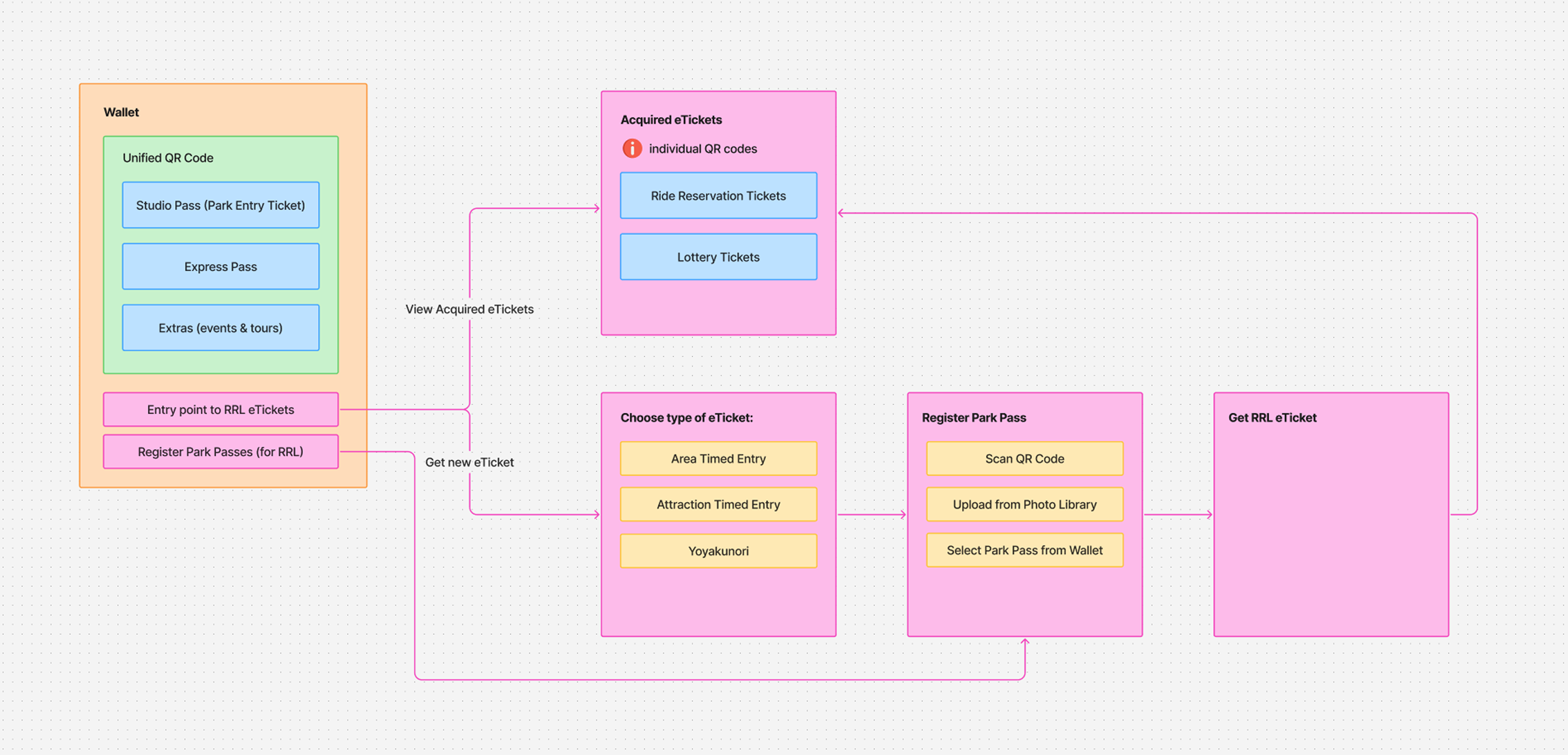
Low-fidelity flow map details how users would access and acquire various types of tickets.
Mid-fidelity flow map demonstrates entry points into acquiring a timed entry ticket and flow options for how users would link park tickets from the wallet.
Technical Opportunities and Limitations
Up until this point, the information architecture detailed two separate spaces for the two types of tickets users could store in the wallet. The main landing page would show the user’s unified QR code(s) for their park tickets and include an entry point to their timed entry tickets on a new page.
After showing some early design thinking of a different approach and conferring with engineering on technical feasibility, I landed on a new direction that would simplify the experience - but that came with a technical constraint to be considered.
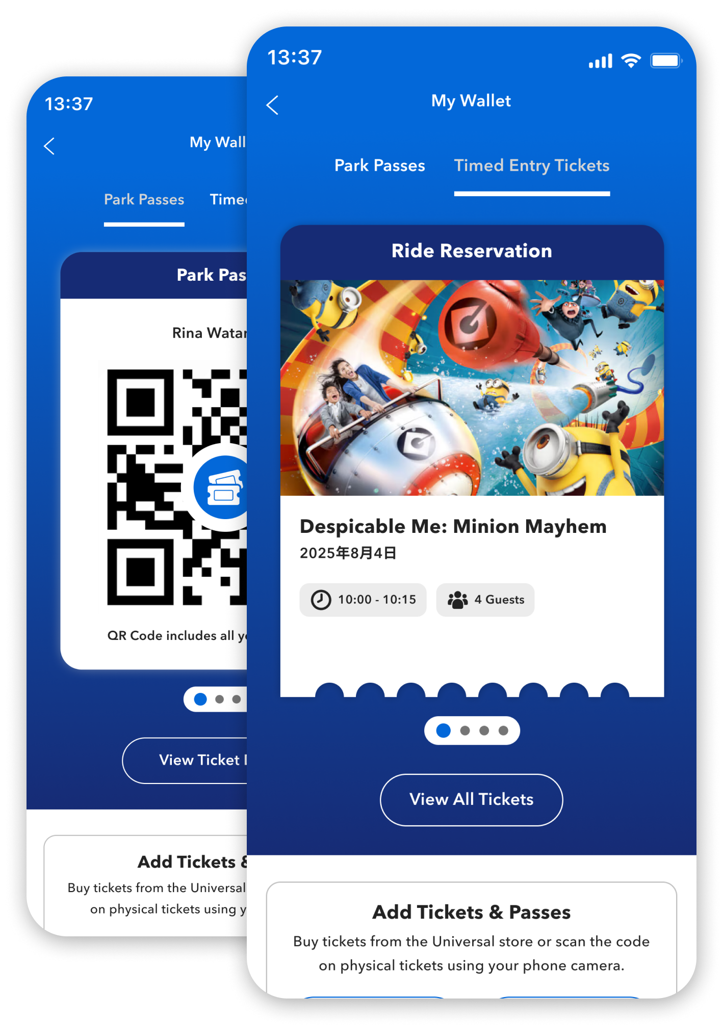
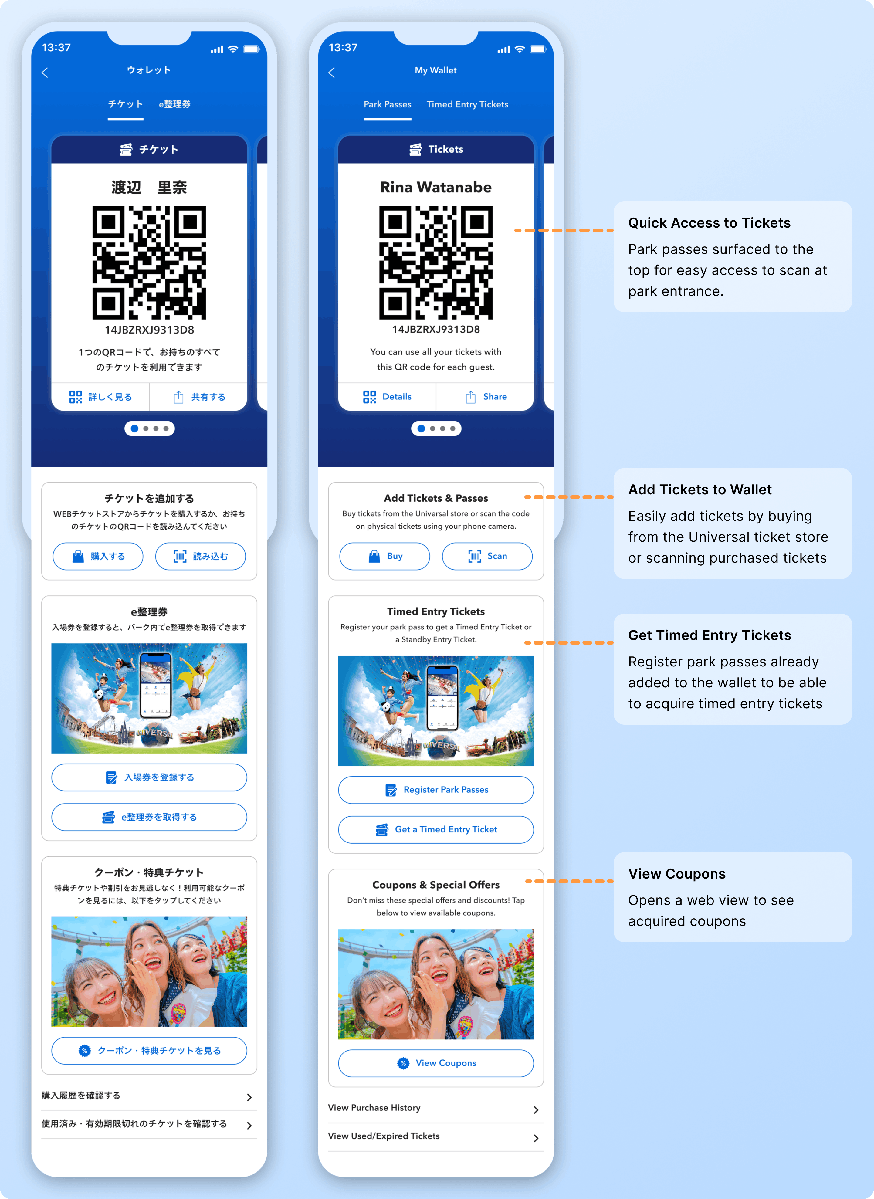
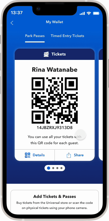
All Tickets in One Place
With this new approach, users could access all their tickets on the main wallet landing page. Tickets would be organized into separate tabs on the same page for simplicity and ease of access.
Mindful Responsiveness
To accommodate the tabbed approach, I needed to ensure that the container could hold multiple tickets without resizing and pushing the rest of the content down where users might miss additional features (or need to scroll too much).
Design Explorations
With an existing design component to display the user’s unified QR code, I explored multiple options for ticket designs to display the timed entry tickets. Through this process, I created tickets that were slight variations of existing components, as well as entirely new design concepts that would be new additions to the design system. With multiple approaches, I was able to present the options to product and engineering and discuss the pros, cons, and feasibility of each option to ensure we could adhere to the expected timeline.
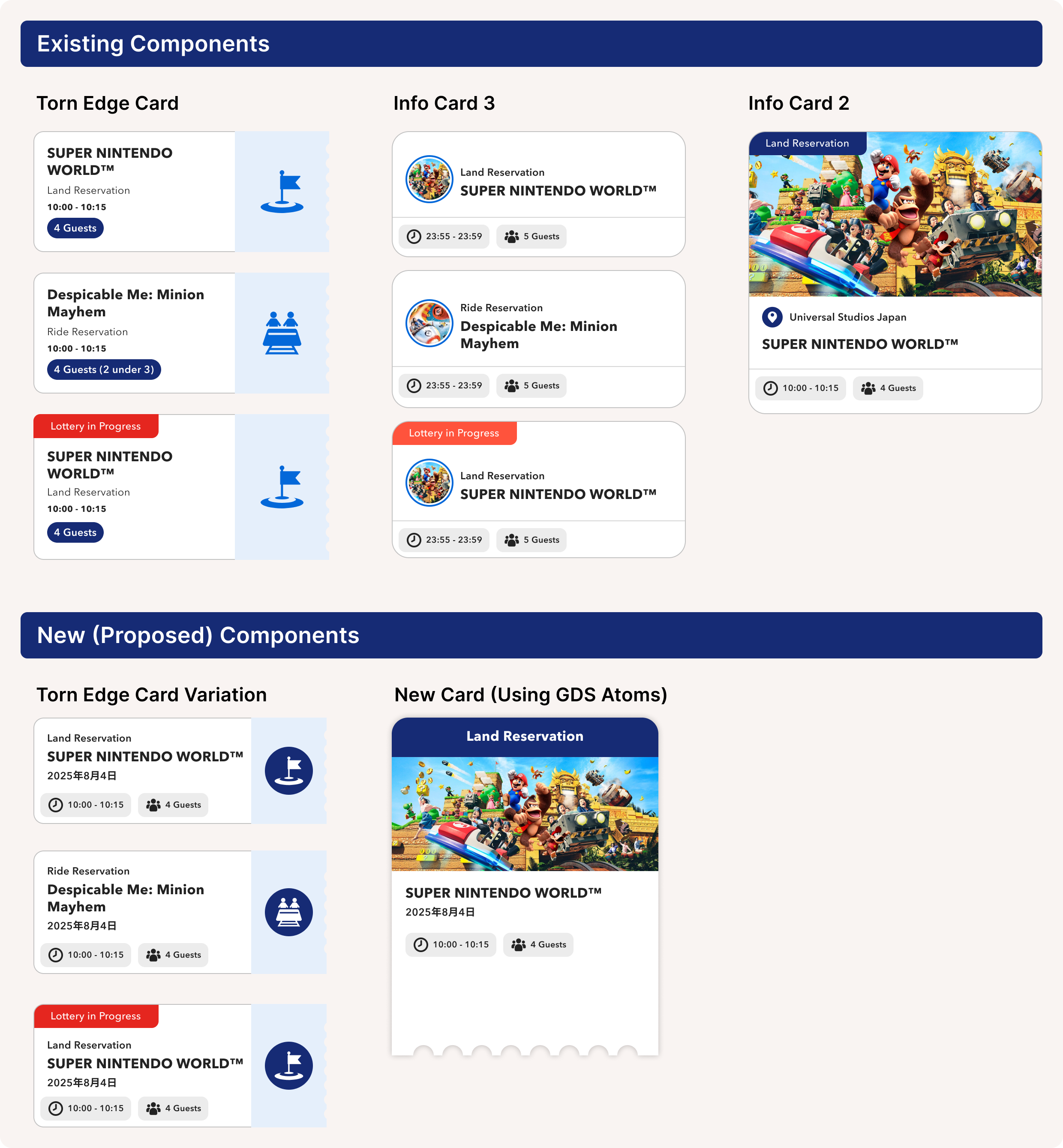
I also created multiple explorations for the wallet landing page. To accommodate the two types of tickets, I established a tabbed structure for the top of the landing page. This approach would surface the highest priority (the tickets) to the top of the page while still providing access to the other wallet features below. I explored options for this approach using various sizes of tickets to consider the best structure and user flow.
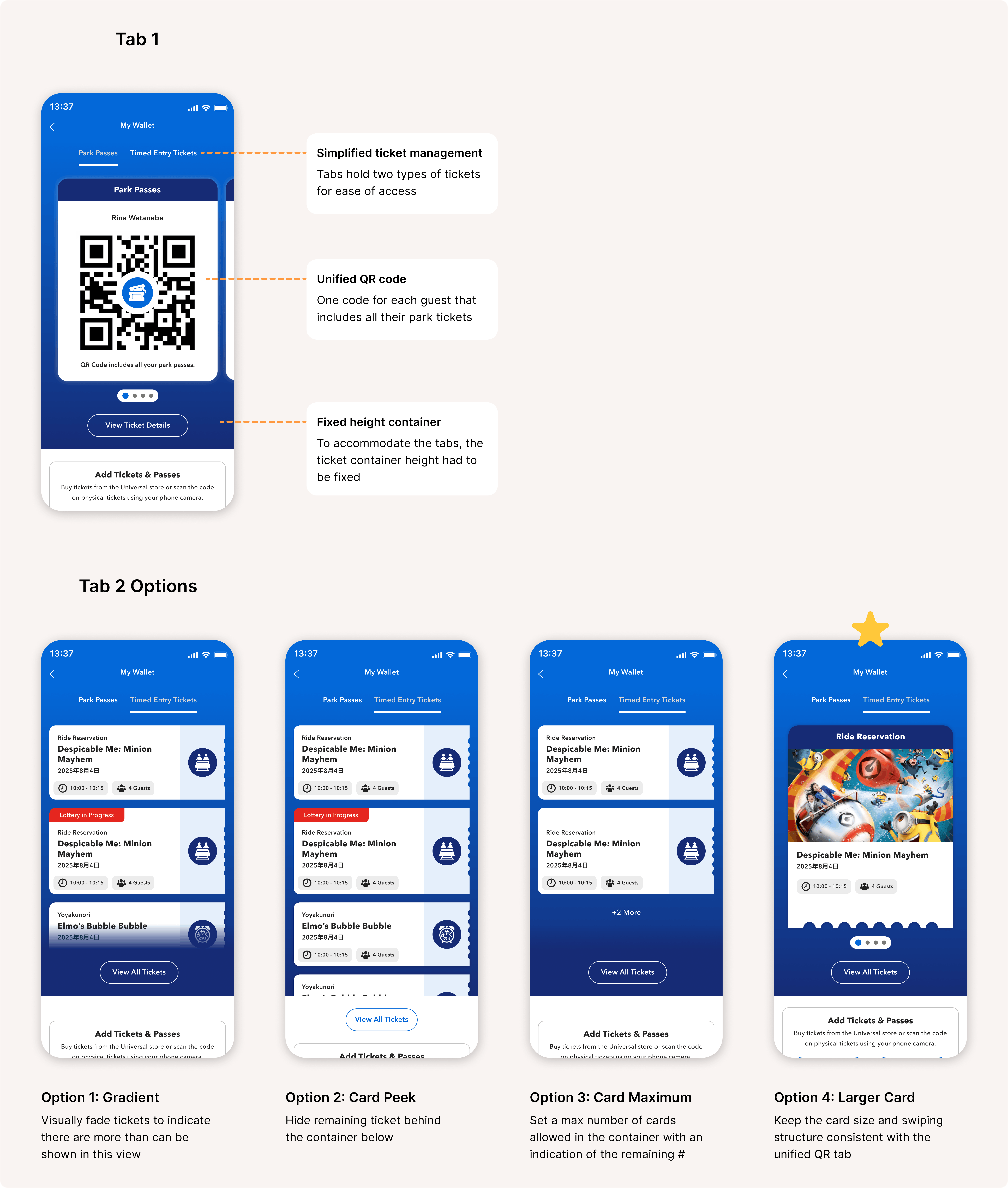
A Simplified Approach
After discussing the above options with product and engineering, we decided to move forward with option 4. While this approach would require creating a new component for the design system, the larger card simplified the experience design, maintained consistency with the Park Passes tab, and introduced visual interest and imagery, adhering to Universal’s brand ethos.
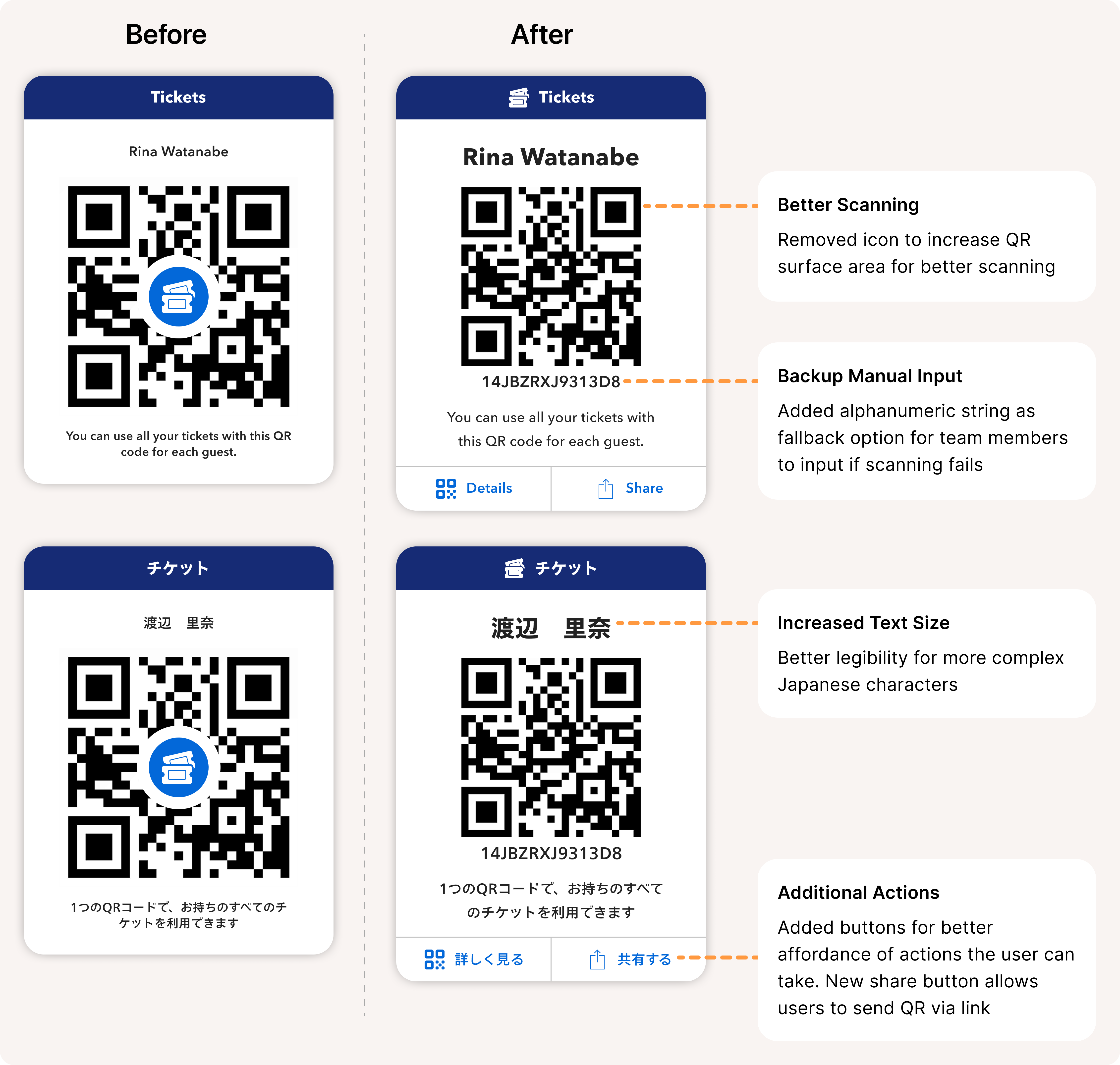
Designing for Localization
After reviewing designs with Japanese stakeholders, we received feedback that the existing QR code card component may not be ideal or accessible for their audience based on scanning equipment limitations and user expectations.
With these in mind, I updated the component to fit the needs of local users.